


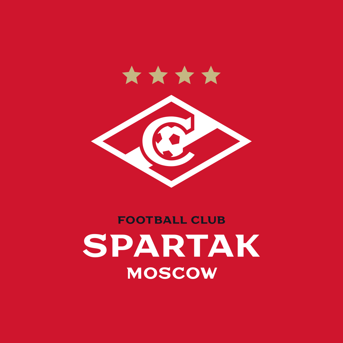
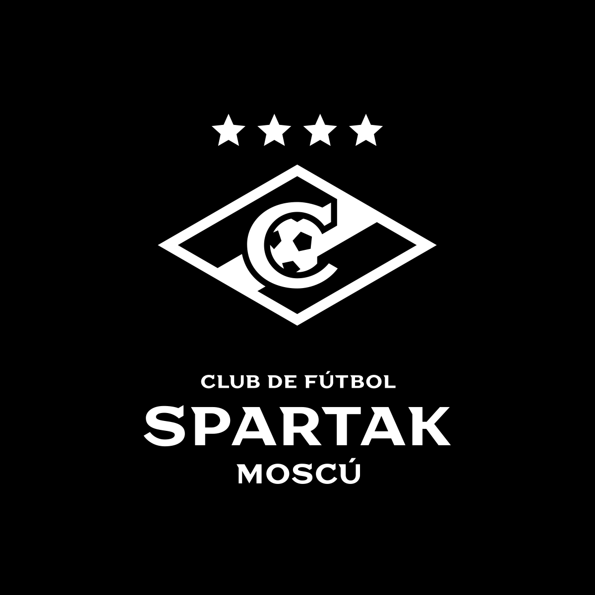
The new logo of FC Spartak Moscow
LOGO • SUBLOGO • FONTS • GUIDES • MERCHANDISE
Spartak Moscow is the most successful club in the history of Russian football. For many people, both inside and outside the country, it’s Spartak who has the most powerful sports branding in Russia, almost part of the cultural code of the nation even. Such a role imposes serious responsibilities, including detailed attention to its visual style.
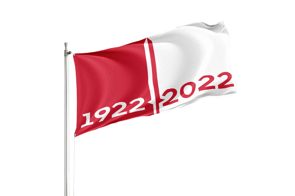
2022 is the year of the centenary of Spartak. For the centenary, the club has planned a large-scale rebranding, which has been implemented by the Quberten studio, with respect for the traditions and the age-old history of the team.
The emblem of Spartak, once created by Nikolai Starostin, is undeniably world-famous. The direction of the line inside has changed, and once even the color, but the rhombus always remained as a rhombus. And despite the basic meaning of the team name containing a powerful revolutionary reference, the logo update stuck to the path of evolution.
We live in the era of global digitalisation. Today it is of critical importance that an emblem meets the requirements of the modern world: it should work well in all forms of media, being readable even on the smallest screens, as well as being technologically advanced and easy to manufacture. The new and eternal rhombus of Spartak meets all these demands. Andrey Gorbunov, author and art-director of the project
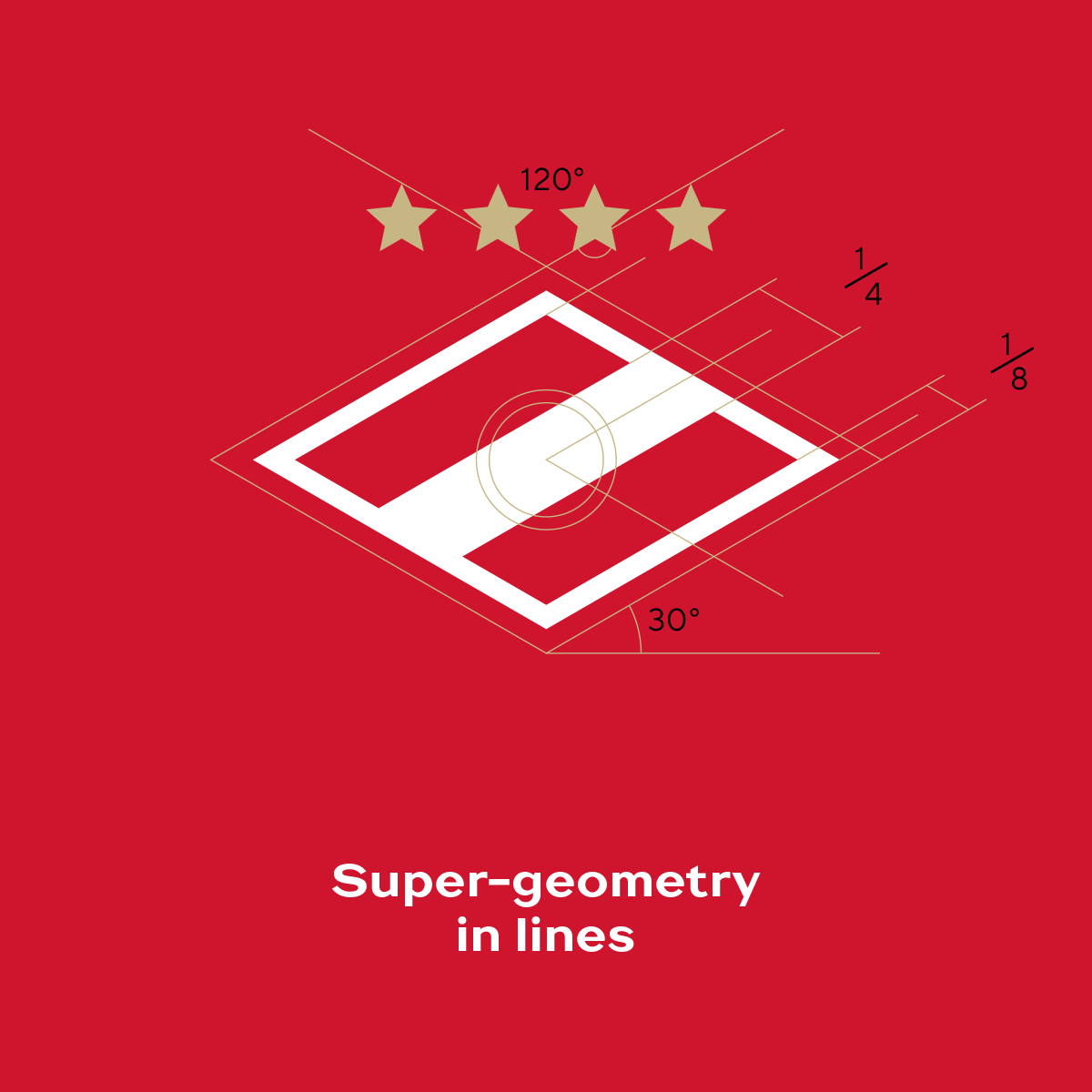
The club did an important work in 2013 when it introduced a logo update and the first brandbook in the history of the team. However, since then, sports design on the whole has completely shifted into a digital reality. With this current work, it was not only possible to subject the emblem to a delicate simplification, but also to make the construction more logical, including finely adjusting the angle of the rhombus’ sides and the location of the stars.
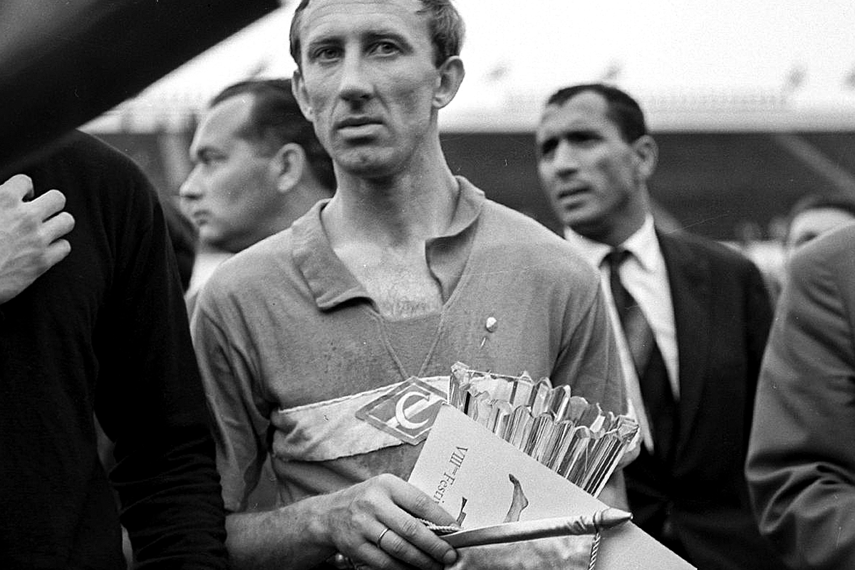
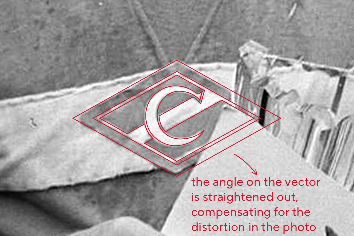
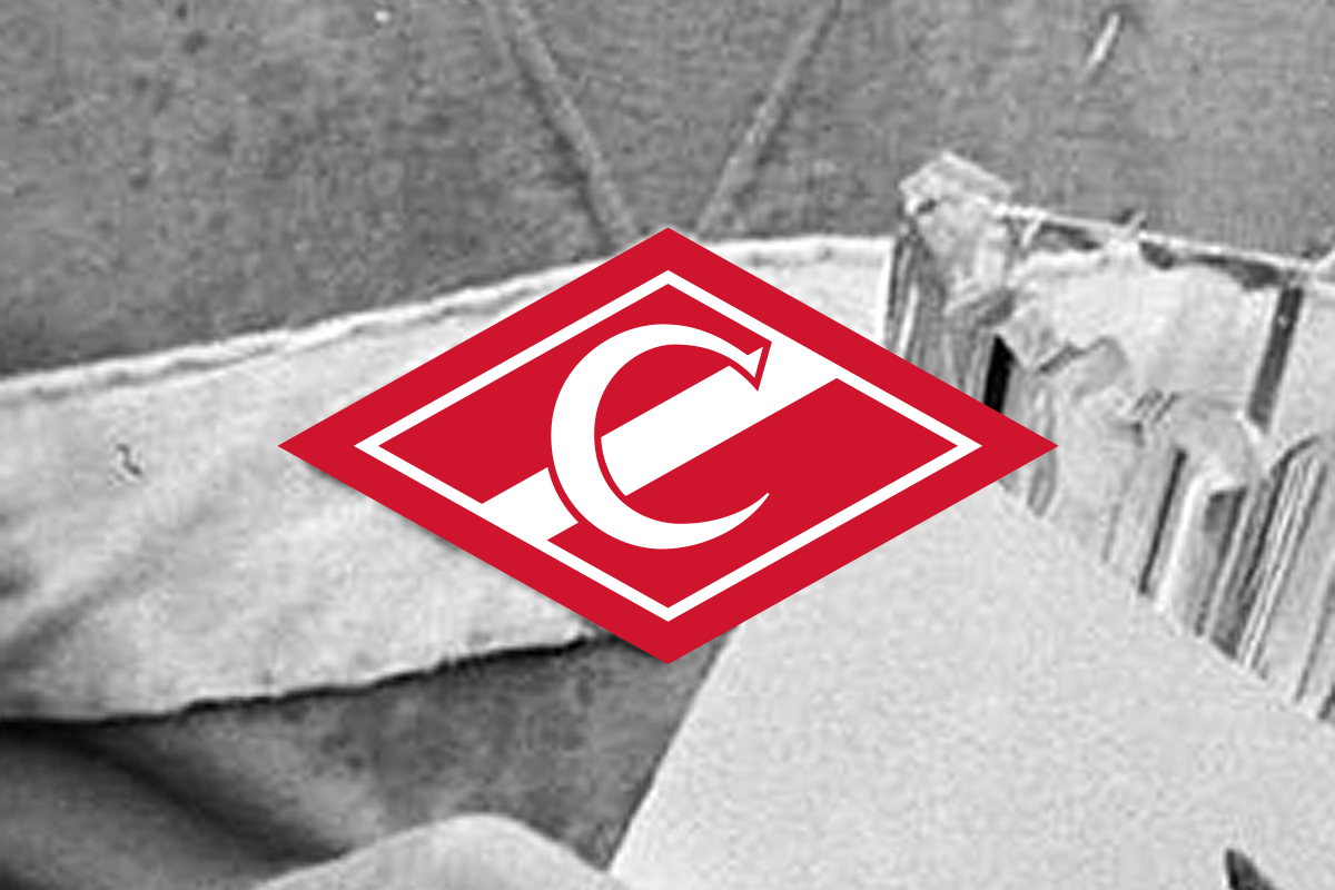
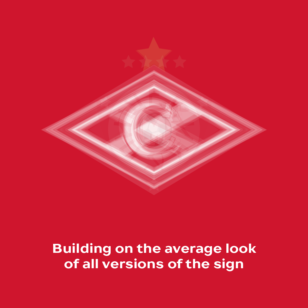
The logo is the focal point from which the development of the identity originates. In order to trace the evolution of the emblem, careful work was carried out with archival photos and, for the first time in the history of the club, a chronology of logos was prepared, starting from the 1930s. All of them are taken from real game kits.

Медиа:


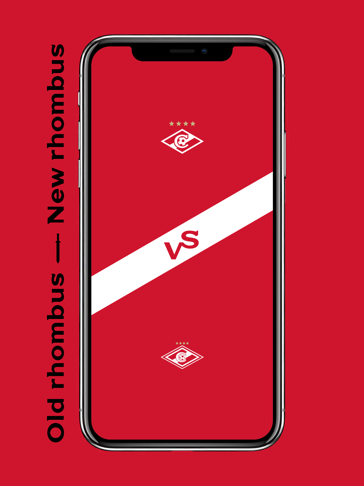
Evolution of the logo
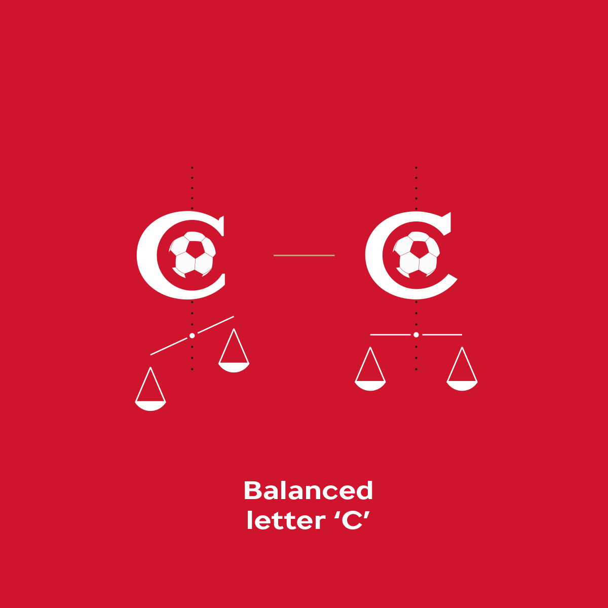
In the new version the serif on the letter ’C’ and the dynamics of the ball pattern, which correspond to the diagonal shape of the sign, give balance to the entire structure. The stars have been made larger; the distance between them and the angles are subordinated to the general geometry. This stabilization and the absence of repetitive strokes around the elements allow you to avoid the moire effect, so the logo looks more confident and is readable even on a microscale. At the request of the club, the ball graphically ’dissolves’ into the strip, now looking less accentuated than on the 1998 and 2013 versions.

Медиа:

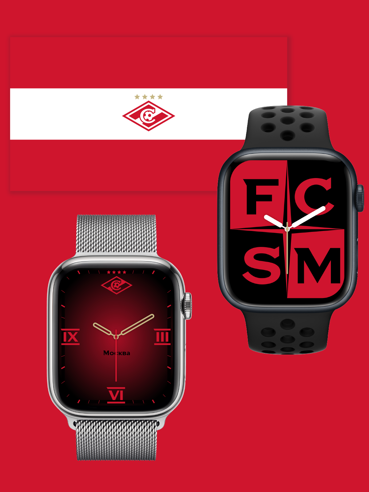
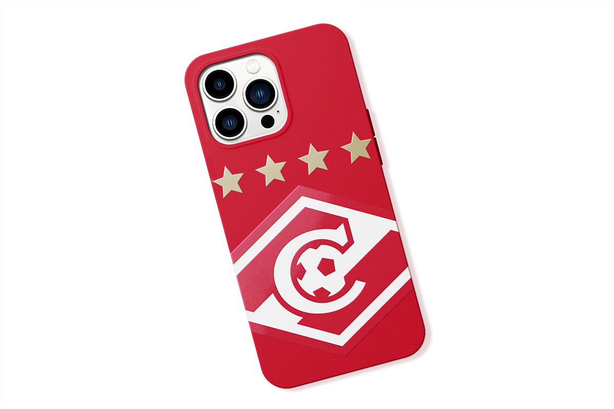
The ultra-small scale demonstrates that the emblem can be easily recognized anywhere, for example on a phone when someone has put it down on a table, in the inscription of a souvenir kiosk in the distance and on the back of a printing booklet. Fans most often interact with the logo either from a long distance at matches, or from an exceptionally short distance, such as in profile pictures on a smartphone screen and TV broadcasts.
Медиа:
Медиа:
Медиа:
Медиа:
Медиа:
Медиа:
Медиа:
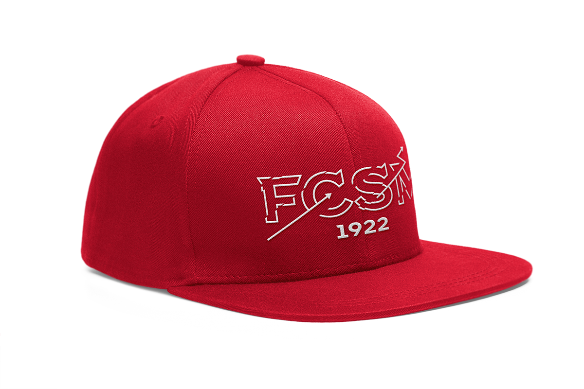
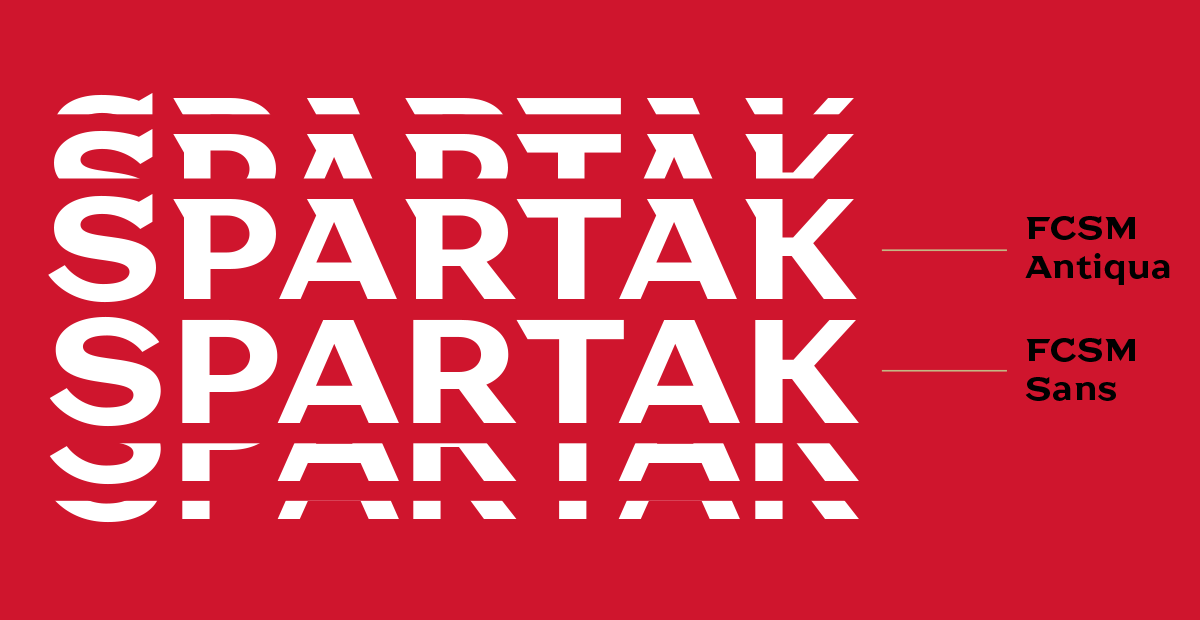
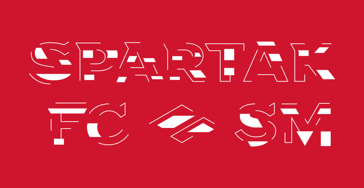
Branded headline font FCSM Antiqua
The studio has developed an exclusive headline font for the club. After the plasticity and tempo were set, Ivan Gladkikh (TypeType) was involved in the assembly of the typeface. The process of creating your own fonts is a trend in global sports organizations. For domestic football, this is still a rarity, so it seemed logical for us that here the team is paving the way for other clubs in the future.
Created in close collaboration between two studios, the FCSM Antiqua font (together with the more neutral FCSM Sans Sans serif) opens up new horizons of visual space for Spartak. It is designed based on the letter ’C’ from the logo, as the quintessence of the club’s history. The font is full-fledged: in addition to Latin and Cyrillic, uppercase and lowercase letters, it also contains Roman numerals, special characters and diacritics. Thus, the club will be able to use the maximum capabilities of this powerful tool.
They are more extensive: the font adapts to the right environment and has different typefaces. So Spartak speaks different languages: from vintage style for the older generation of fans, to modern chopped for young fans. The font is recognizable, and emphasizes the status of a truly nationwide team, most vividly reflecting the key idea of Spartak’s world.


Медиа:


Медиа:
Other works
JetRush Corporate Identity
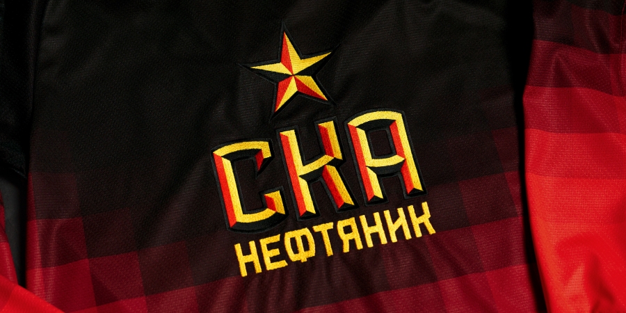
Black and red: the development of the SKA-Neftyanik identity
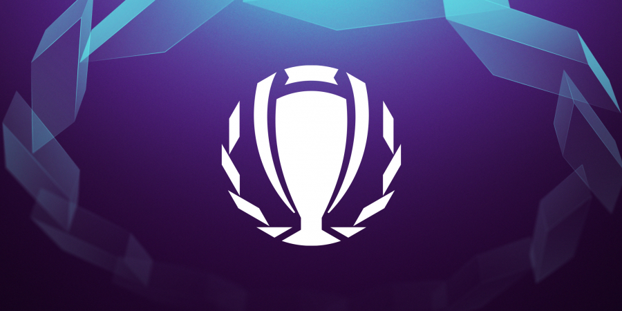
Business Champions League. Expanding the boundaries of identity
Vikings on top. PBC Runa identity